Twenty-six machine-learning tools, two survivors: designing the front door for the consolidation.
Indeed was reducing its internal machine-learning platforms from twenty-six tools down to two. Running offline experiments took months. Feature discovery, one data scientist put it, had always been one of the biggest headaches in the system. I led UX across three connected workstreams: a Chrome-extension pivot on Loom, the MDP catalog and feature-registration form, and a unified Hub IA built from a card sort.
§ Catalog data · At a glance
- Company
- Indeed
- Product
- ML Platform: MDP (data platform), Loom (ML platform), and the unified Hub vision.
- Users
- Data scientists, ML engineers, and platform Product Managers. Five MDP personas, four Loom personas.
- My role
- Sr UX Designer. Discovery, information architecture, card sort facilitation, competitive analysis, feasibility analysis, concept design and wireframing, high-fidelity Figma design, engineering partnership, design specs and handoff.
- Timeline
- 2024–2025
- OKR alignment
- KR4.1 (30% model migration to Loom/Butterfly), KR2.2 (MLBT adoption).
Loom and the Chrome-extension pivot
When the original brief broke down, I recommended a different shape.
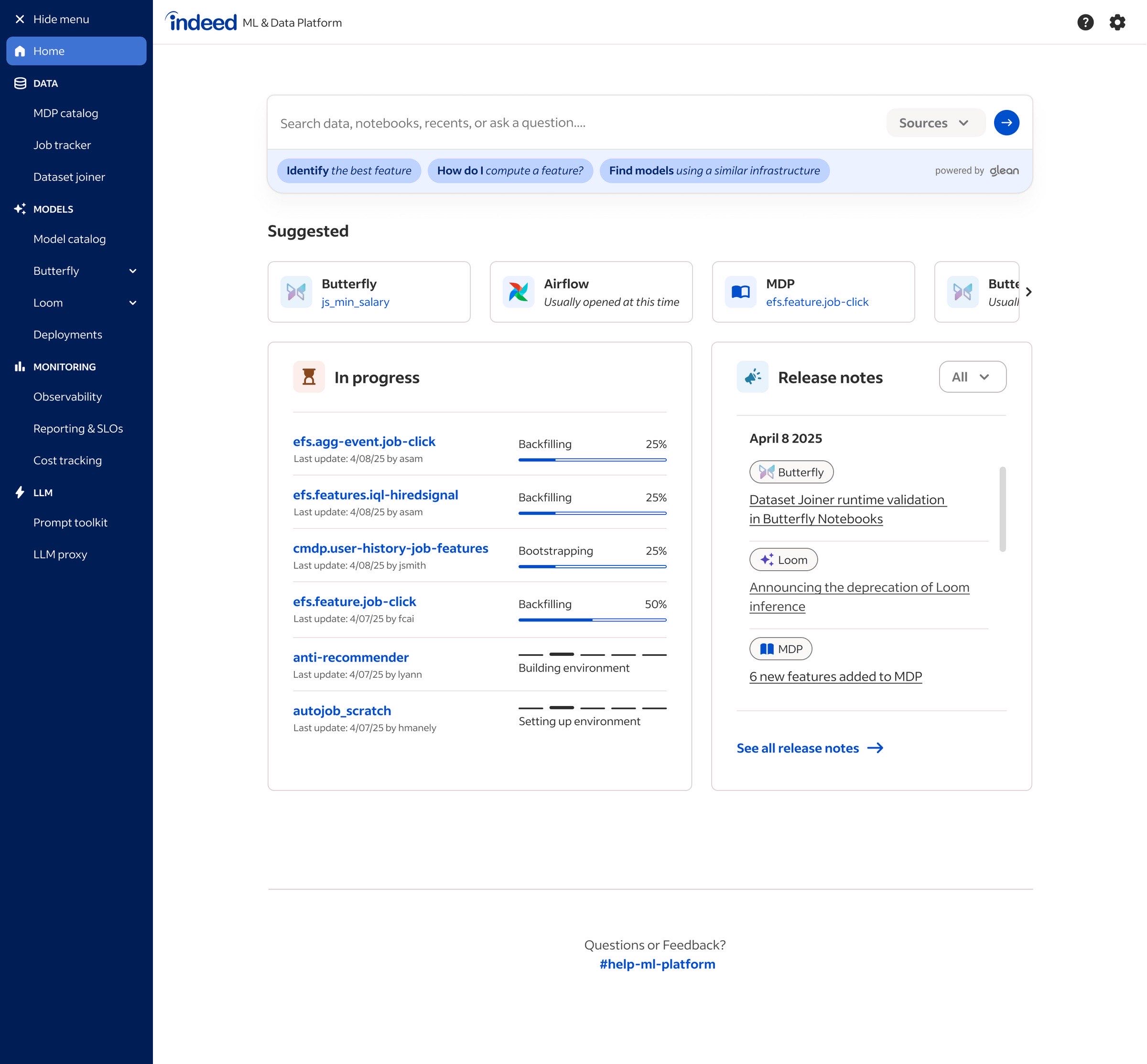
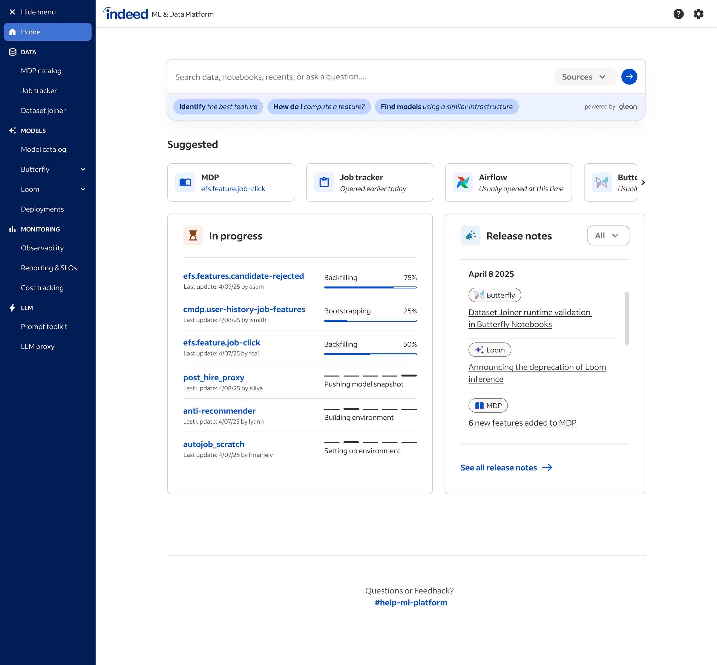
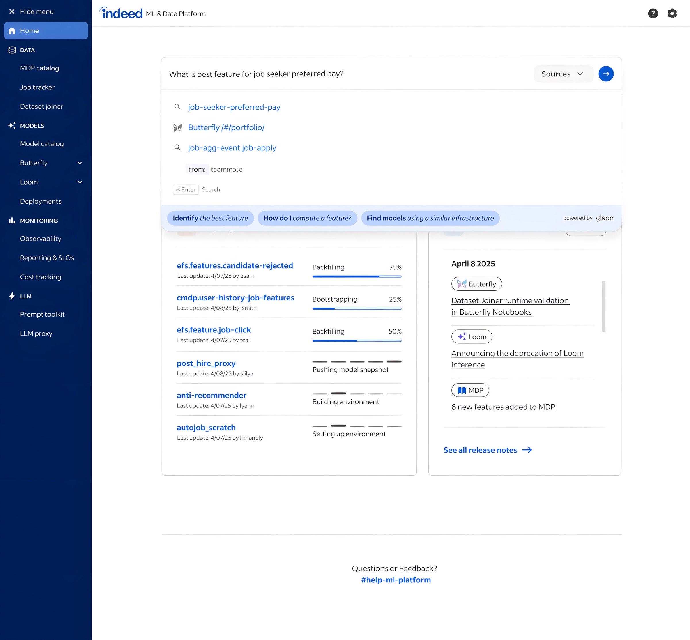
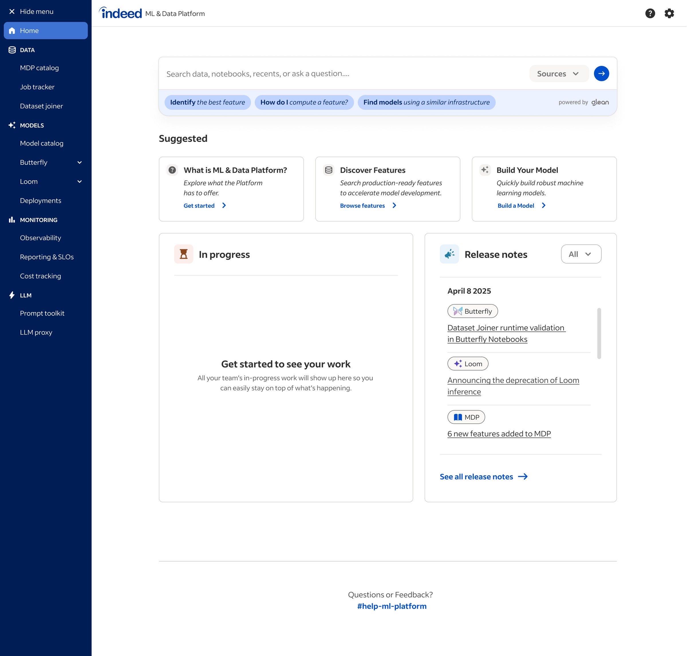
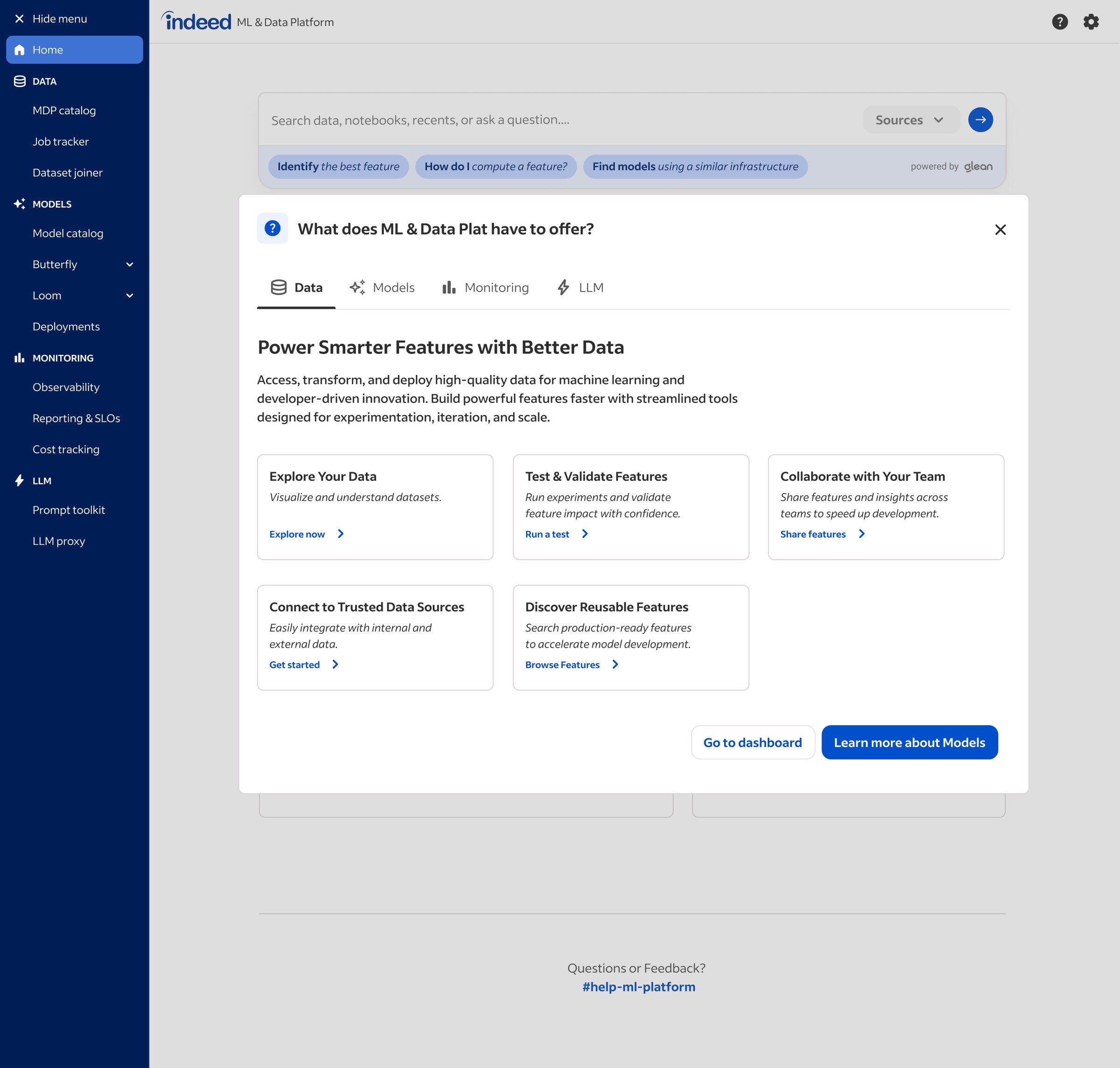
The original brief for Loom was a unified homepage that would surface real-time activity from Sagemaker, MLflow, Grafana, and Datadog. I started by mapping the end-to-end Loom journey, an artifact I used to bring teammates up to speed on the platform's flow.
The dashboard concept tested well. Data scientists wanted direct access to the models they were working on, recent activity across their team, model build status, and customizable navigation. The idea landed.
Then engineering reality came in. Working through it with the Loom dev team, I found Sagemaker is closed-source and exposes no APIs for user activity. MLflow, Grafana, and Datadog each had a customization-cost-to-integration-value imbalance. Iframing brought latency, accessibility, and UX problems. The data we needed to deliver the dashboard's value proposition wasn't readable at acceptable cost.
I authored a feasibility report recommending a Chrome extension instead: persistent Loom navigation across the user's browser, with no attempt to absorb the other tools' UIs. The extension would carry feature cards for launching components, embedded Glean search, and a way for users to add the components they used most. I named the adoption-gap risk explicitly. The recommendation moved into Loom planning, and my ongoing Loom UI work contributes to the team's model-migration and adoption OKRs.
Thom has been instrumental in supporting me in building a seamless end-to-end UI for Loom. His contributions will directly impact KR4.1 Migration 30% of all existing models are migrated to Loom or Butterfly and KR2.2 Adoption of the MLBT OKRs.
Loom Product Manager
MDP: Data Catalog and Feature Registration
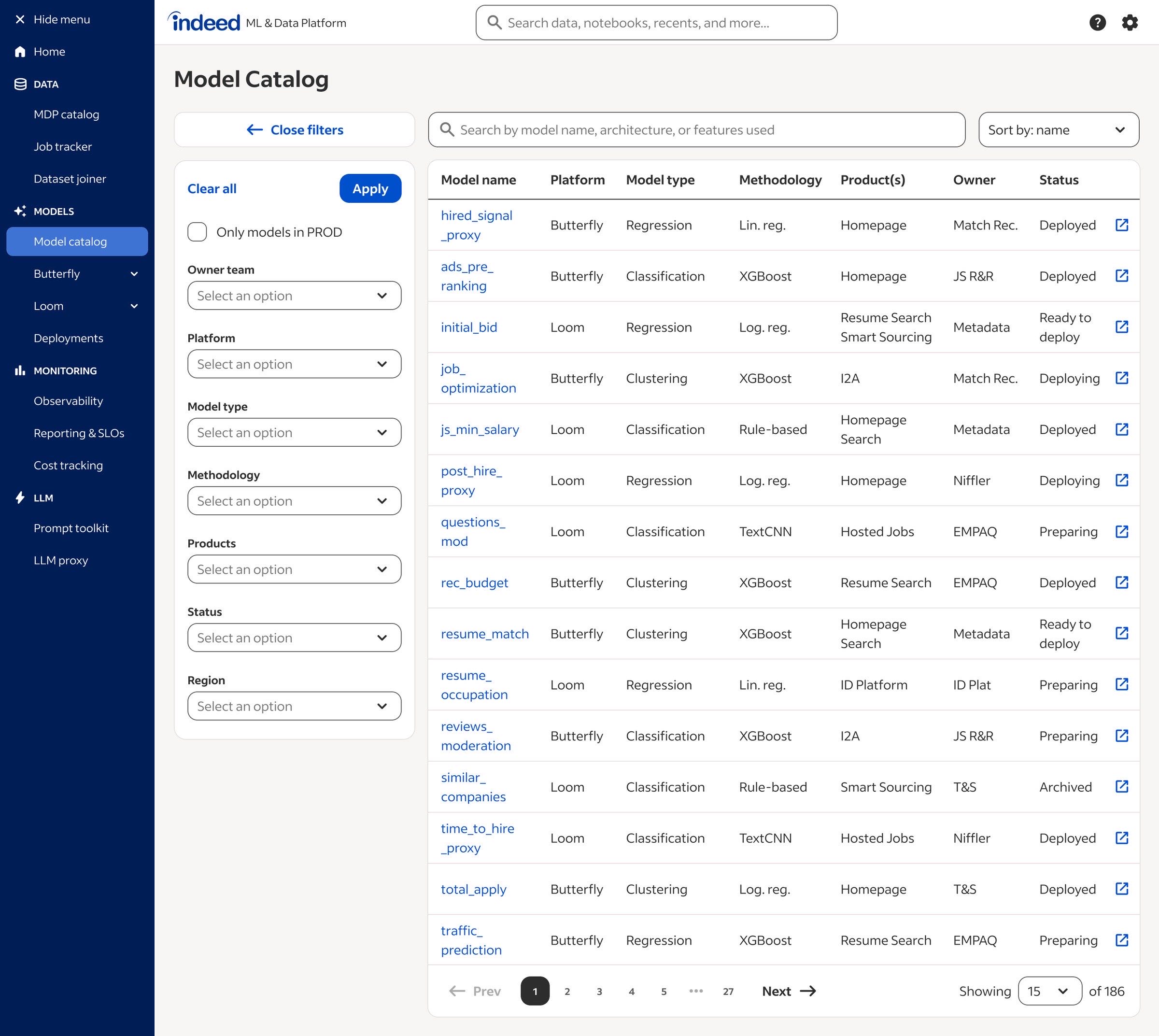
The catalog UI for finding data, and the form-based workflow that auto-registers features into production.
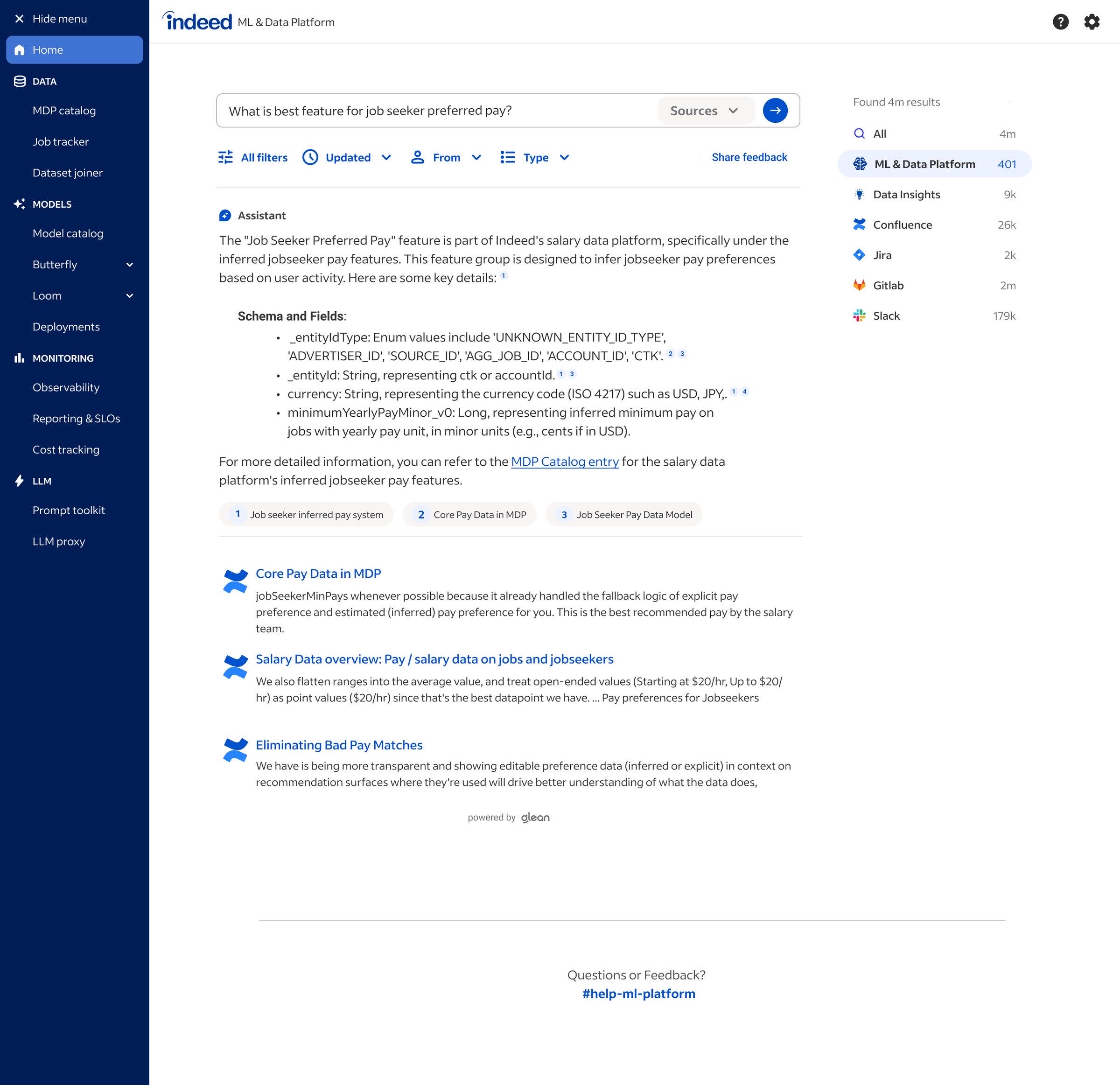
MDP is Indeed's data platform. Two surfaces needed UX work: the Data Catalog (where data scientists discover and inspect datasets) and Feature Registration (the workflow that promotes a candidate feature into production).
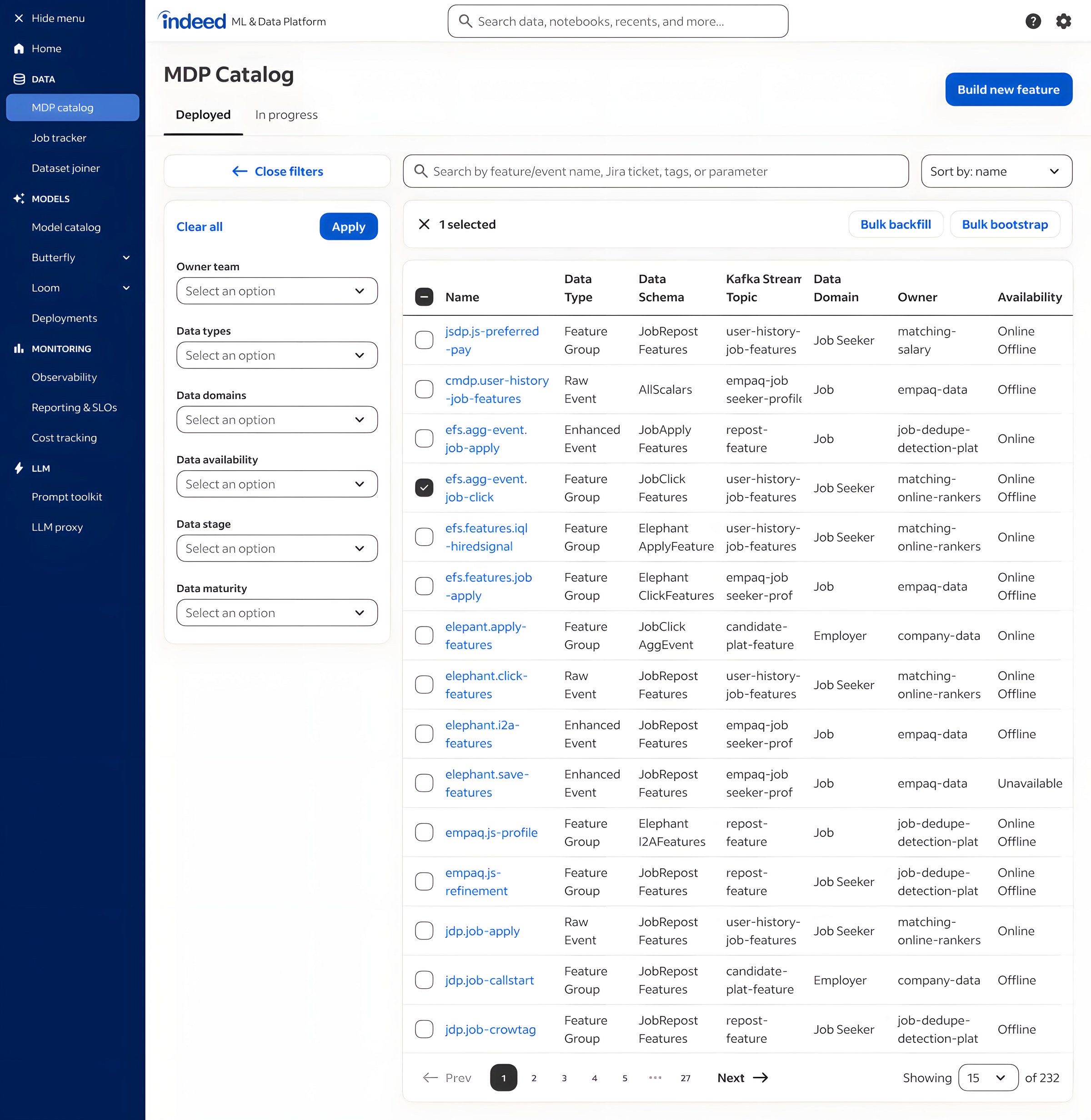
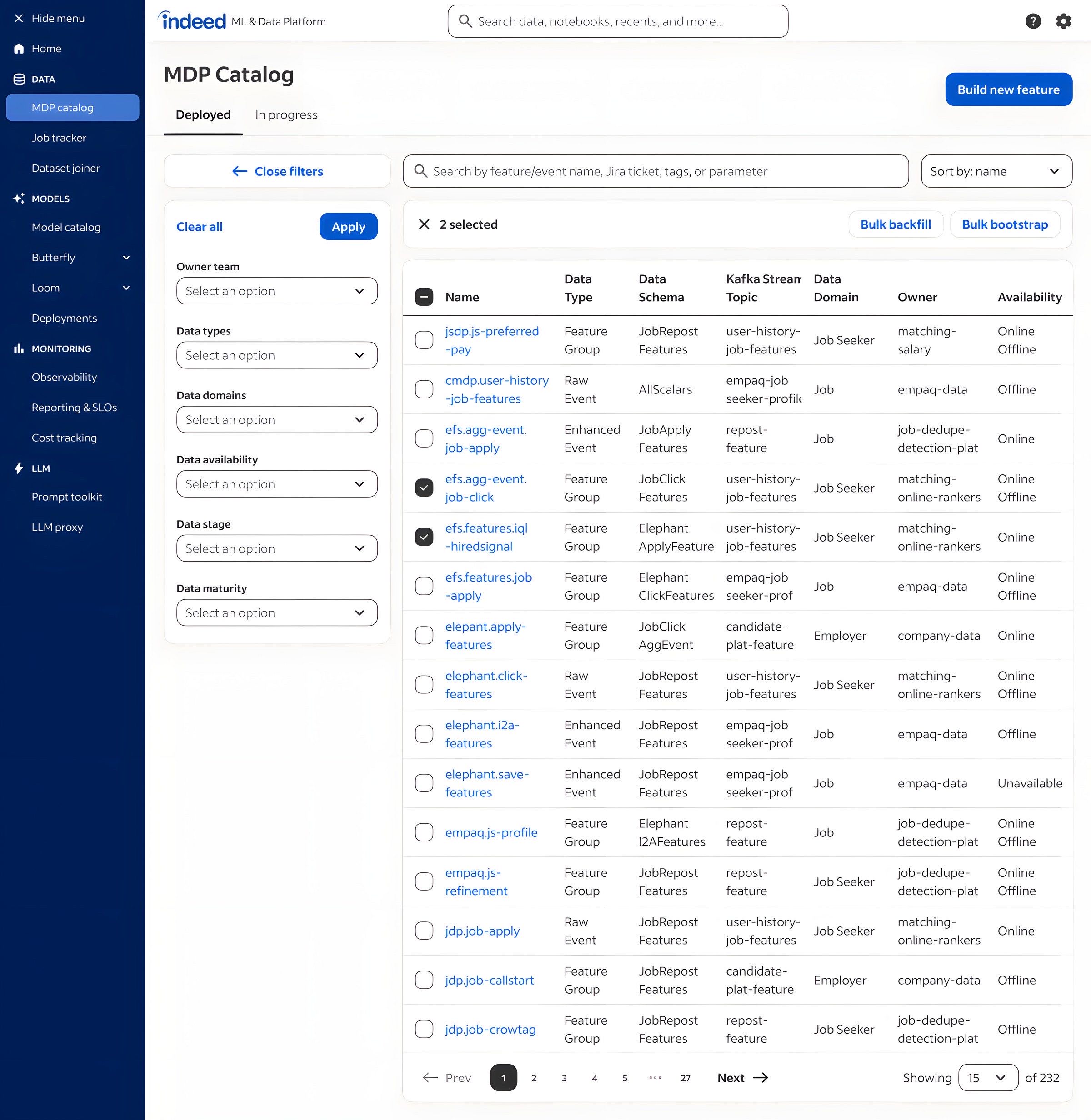
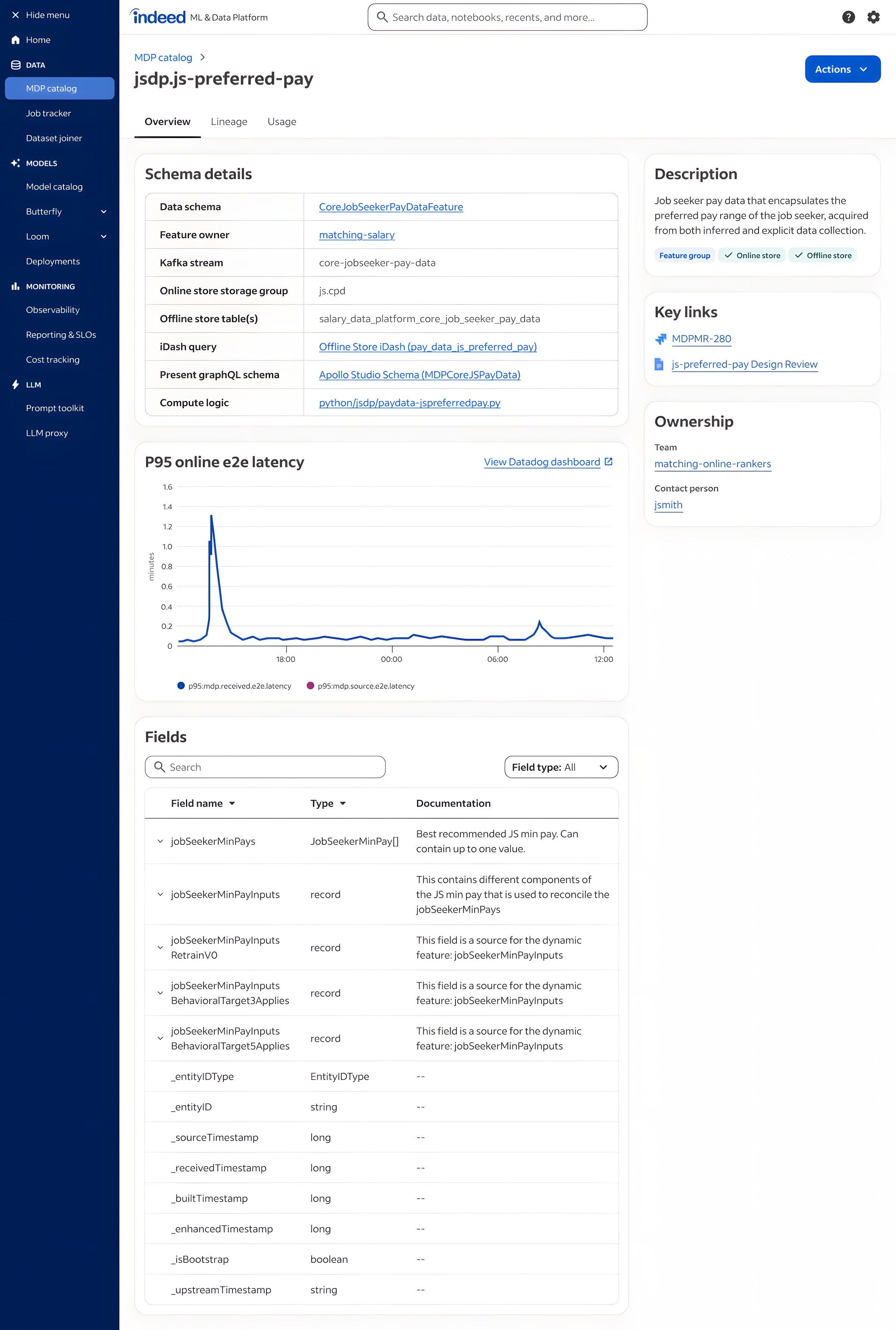
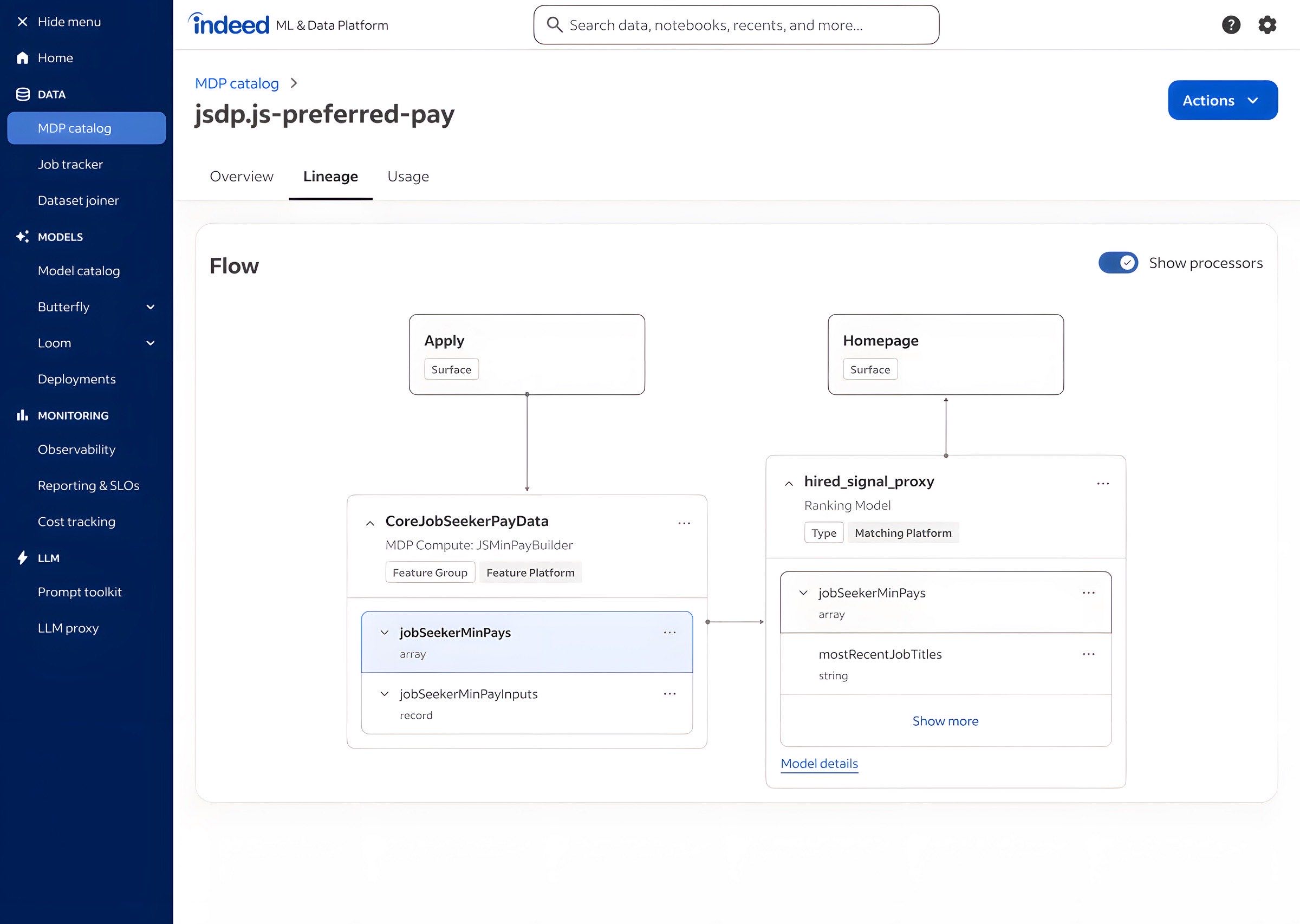
Data Catalog
The existing catalog dumped a 112-parameter filter list on the user. I redesigned it around validated user needs: the top six filters surfaced first, the rest collapsed under "More." Detail panels surfaced lineage, ownership, freshness, and recent schema changes inline, so data scientists could assess a dataset without leaving the catalog.
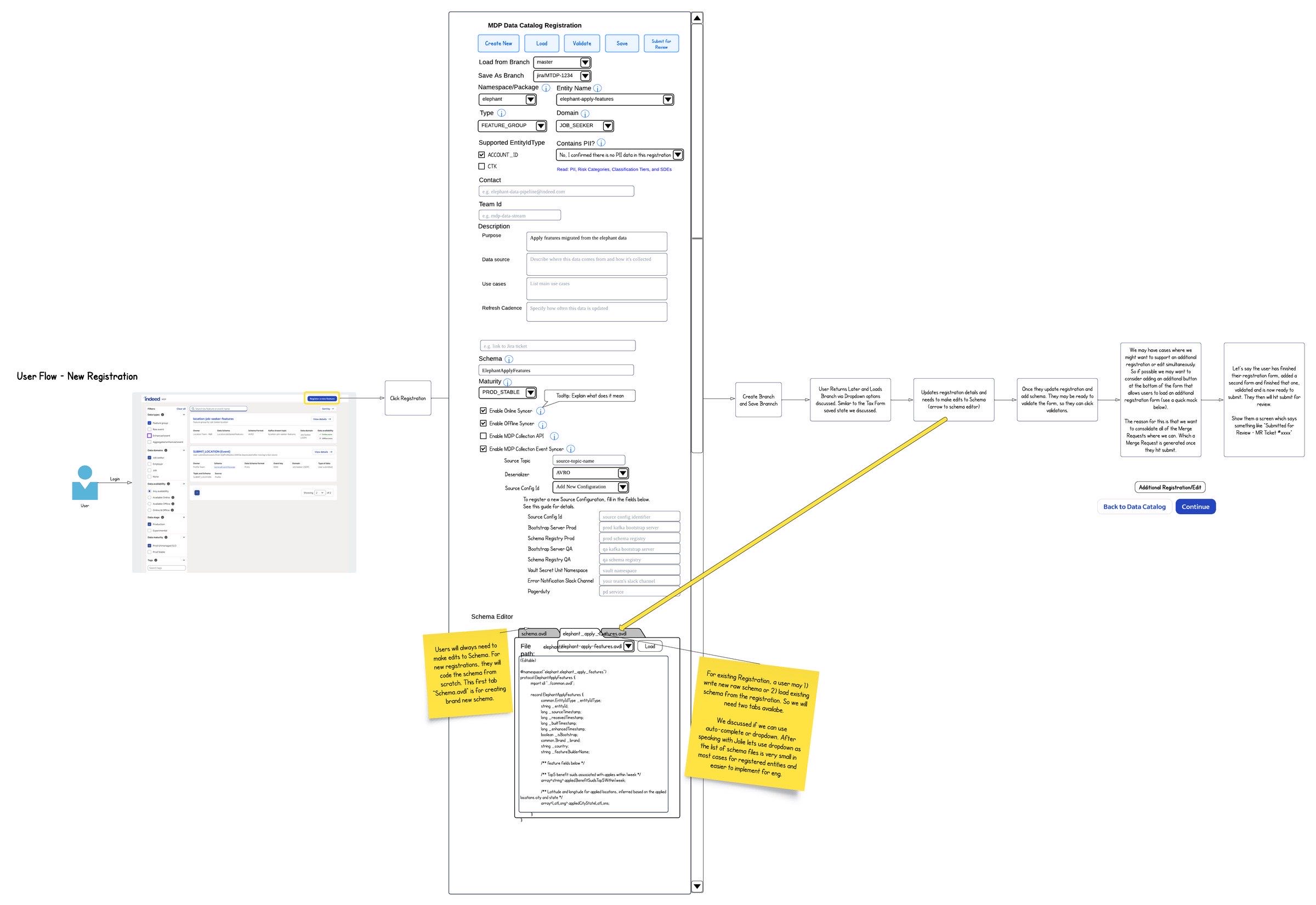
Feature Registration
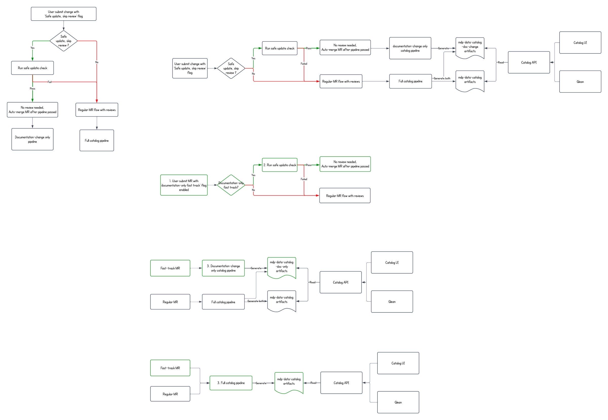
The Product Manager authored the problem space and sketched a rough wireframe. I designed the form-based UI from rough through final implementation spec. The form auto-generated internal fields (kafka topics, sort keys, table mappings), validated input before submission, and auto-created the merge request via the GitLab API with Slack-tagged review routing.
Thom created a number of Mocks and wireframes for the Catalog UI and MDP Home pages. We often reference Thom's work in order to see in practice how a particular feature will actually look and work once it's done, allowing us to save development time.
MDP Product Manager
Unified Hub IA
A six-section information architecture from a 10-participant card sort and competitive analysis.
With Loom on a different path and MDP shipping its own surfaces, the consolidation needed a front door. I facilitated a 10-participant card sort with data scientists and ML engineers, ran the results through dendrogram analysis, and proposed a six-section IA: Home, Getting Started, Data Foundation, Models & Deployment, Monitoring & Cost, Generative AI.
The competitive analysis surfaced a gap in cost-in-context. None of the comparable platforms (Sagemaker, Vertex, Databricks) put per-model cost in the model detail view at the time. I made it a first-class field. Engineering didn't push back because the data was available; the team just hadn't been asked for it before.
A platform consolidation, organized around user mental models instead of team structure.
The thread across the three workstreams was user mental models. The IA was organized around how data scientists actually think about their work, not how the underlying teams are structured. When the integration cost on Loom outweighed the value of a unified homepage, I recommended a Chrome extension instead. When the catalog needed filters, I designed them around validated user needs rather than mirroring an existing 112-parameter filter dump.
26→2
Internal tools consolidated
10
Card-sort participants
6
IA sections proposed