Three product teams, three breaking workflows, one design approach: make the hidden structure visible.
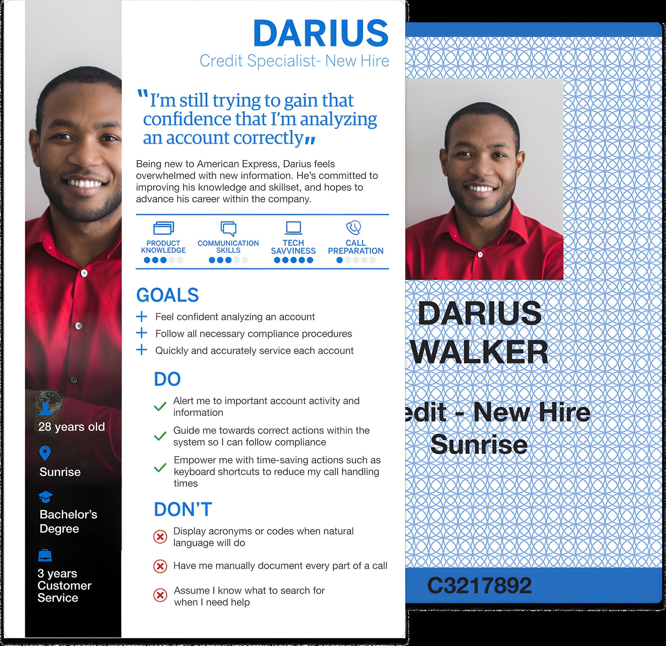
I led design across three American Express credit-servicing applications, each owned by a different product team: a 20-year-old servicing portal too dense for live customer calls, a collections workflow run on email and Excel, and an agency-routing dropdown about to break past 200 statuses. The teams were separate, but the approach was the same: map the real structure, make it visible at the moment of decision, and iterate with the Specialists doing the work. I took all three from discovery through development handoff, and stepped into a Product Owner role when the ACP team needed Scrum coverage.

Scroll → Three internal credit-servicing applications in Amex’s Credit Specialist function, taken from concept through development handoff.
§ Catalog data · At a glance
- Company
- American Express. Three internal credit-servicing applications, each owned by a separate product team, used across servicing, late-stage collections, and third-party agency placement.
- Users
- Credit Specialists across servicing (CSP), late-stage collections (IPM), and agency placement (ACP) roles, spanning multiple markets and entitlement levels.
- My role
- UX Designer. Led discovery, IA, and high-fidelity design across all three teams, concept through development handoff. Stepped into a Product Owner role when the ACP team needed Scrum coverage: wrote features and user stories and prioritized for development.
- Team
- Three separate product teams (Product Owners, engineering) and Credit Specialists across markets (workshops, focus groups, testing).
- Timeline
- 2018–2020, discovery through phased launch.
- Outcome
- Two applications shipped, one funded and handed off. Over an hour a day of manual Excel entry eliminated per Specialist when the IPM dashboard shipped.
How I worked across three teams
Three product teams, three different problems, one consistent design approach.
These were three independent product teams. What carried across all of them was a consistent way of working, and a Product Owner step-in when one team needed coverage.
Map the real structure before redesigning
In CSP, that meant mapping the application down to field-level entitlements. In IPM, it meant understanding how Specialists personally categorized and controlled their case inventory. In ACP, it meant uncovering the placement-level logic hidden behind a flat status dropdown. Each engagement started by surfacing an implicit structure nobody had drawn yet.
Make the structure visible at the moment of decision
Each redesign turned hidden operational logic into something a Specialist could see and act on without hunting, whether on a live customer call, managing daily case volume, or routing an account to the correct agency.
Test with the people doing the work
CSP evolved through weekly focus groups. IPM enhancements came from post-launch research. ACP went through three rounds of usability testing before earning Product Management alignment and development resources. When the department needed a Product Owner to cover the ACP Scrum team, I stepped outside the design role to write features and user stories and prioritize them for development.
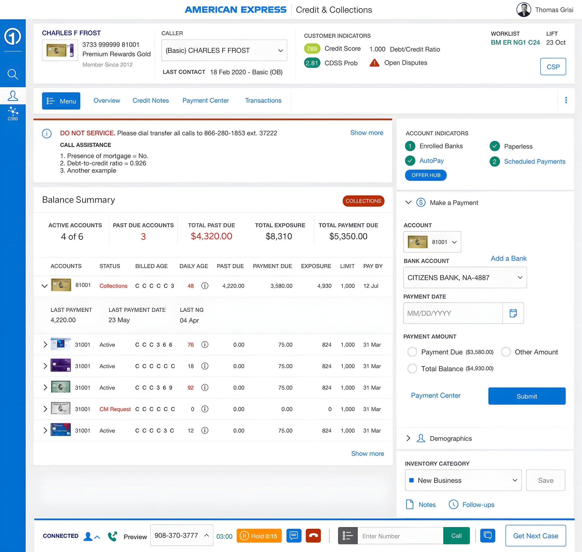
CSP: rebuilding the Overview for live servicing calls
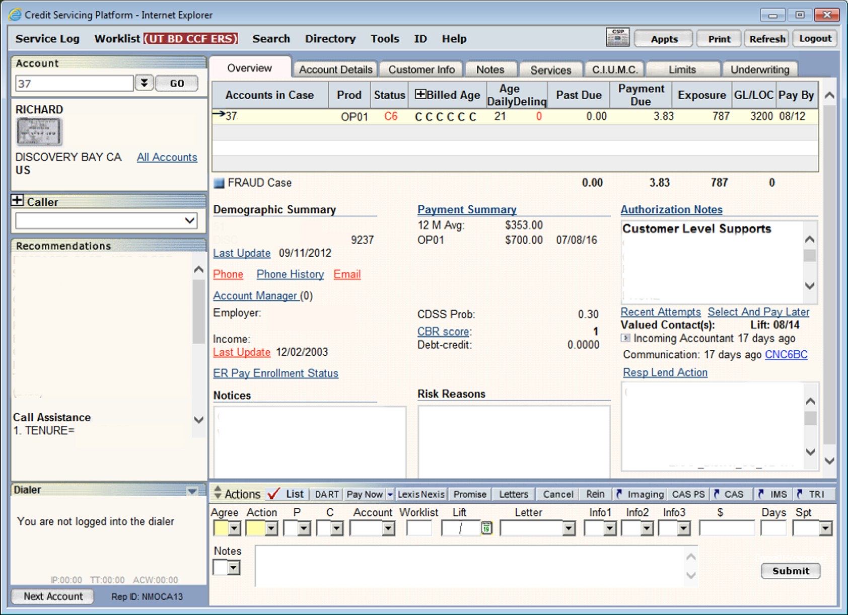
Credit Servicing Portal · shipped. A 20-year-old portal too dense for live calls, rebuilt around the one question a Specialist needs answered: what happens next for this account?
The Credit Servicing Portal had been built out over 20 years. Specialists could reach the same information through multiple paths, and the Overview page had become a dense content dump. That mattered because the Overview was the screen Specialists used during live customer calls. When everything appeared at once, Specialists stalled while looking for the next action on an account.
Discovery
Two problems surfaced repeatedly: the application felt slow, outdated, and difficult to navigate, and the Overview was too dense to support fast decision-making on live calls. The real problem underneath both was that the application’s structure was invisible. Before I could redesign the Overview, I had to understand what the portal actually contained and how it changed across roles and markets.
Decision · Map the application before redesigning the page
CSP behaved differently depending on a Specialist’s market, role, and entitlements. A surface-level redesign risked breaking workflows for users I had not accounted for. With the Product Owner, I mapped the application down to subpages, fields, and entitlement variations, then grouped the content into functional themes such as Payments, Account Details, and Demographics so we could think beyond the legacy page structure. The map gave the team its first complete picture of the application, and it became the foundation for the new Overview information architecture. It cost weeks of inventory work before visible design started, the right trade because the redesign had to hold across roles, markets, and regulated servicing workflows.
Decision · Use paper modules to define hierarchy with Specialists
The arrangements varied, but the highest-priority content was consistent enough to define the page hierarchy. The workshop converted abstract preferences into concrete layout decisions, and it doubled as a test of the new Amex design system against a dense enterprise use case. New hires revealed friction experts had normalized, but their perspective had limits; weekly focus groups with experienced Specialists later helped correct and refine the hierarchy.
Decision · Design the Overview around “what happens next”
The workshop gave me patterns, not a finished page. The final design had to answer one question faster than the legacy experience: what should the Specialist do next for this account? The redesigned Overview prioritized account state, next-step information, and the most frequently needed servicing details. Lower-priority reference content moved deeper into the page or into supporting sections, reducing the need to scan everything at once. Entitlement variation was handled through modular sections that could appear, hide, or adapt based on role and market without changing the overall page logic.
Specialists no longer had to parse a content dump during live calls. Promoting the most critical information meant demoting content that some experienced Specialists were used to seeing immediately, and the weekly focus groups helped identify which changes improved speed and which created unnecessary relearning.
Outcome
The CSP Overview redesign shipped and continued to evolve through weekly focus groups across markets and Specialist roles.
IPM: replacing Excel-and-email collections tracking
Individual Portfolio Management · shipped. Over an hour a day of manual entry per Specialist, replaced by a dashboard that preserves personal control.
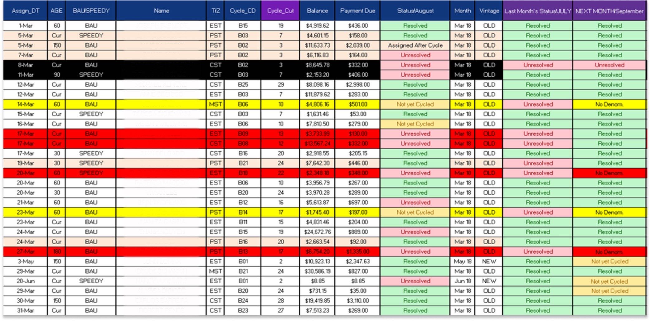
High-performing Late-Stage Collections Specialists managed their own case inventory. Before IPM, they received cases by email and tracked them manually in Excel. That workflow gave Specialists control, but it came at a cost: more than an hour a day of manual entry per Specialist, plus the risk of errors in a regulated collections environment.
Solution · Preserve control, remove manual tracking
The IPM dashboard moved daily case inventory into a single system view. Specialists could organize cases into predefined categories while still assigning them in a way that matched their personal working style. The goal was to preserve what made Excel useful, personal control, while removing the manual entry and invisible handoffs.
Decision · Formalize peer support without blurring ownership
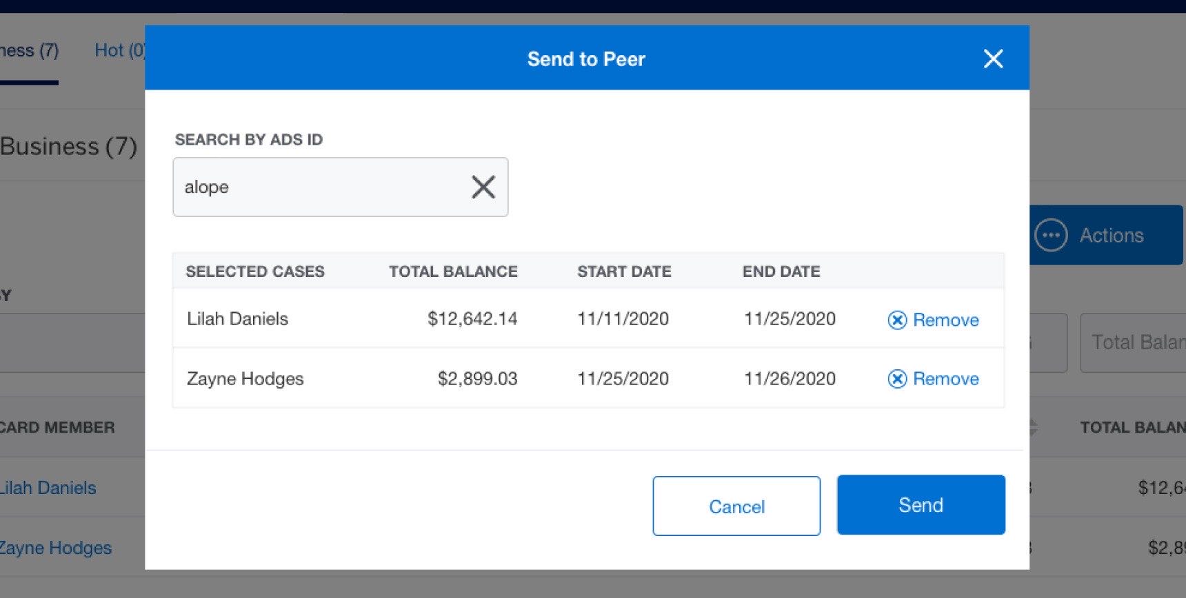
Post-launch research surfaced a common informal behavior: Specialists asked peers to help with difficult collections cases or cover inventory while they were away, over email, outside the system. I led the design for Send to Peer, which formalized that behavior inside IPM. These were regulated collections cases, so the system needed to make accountability clear.
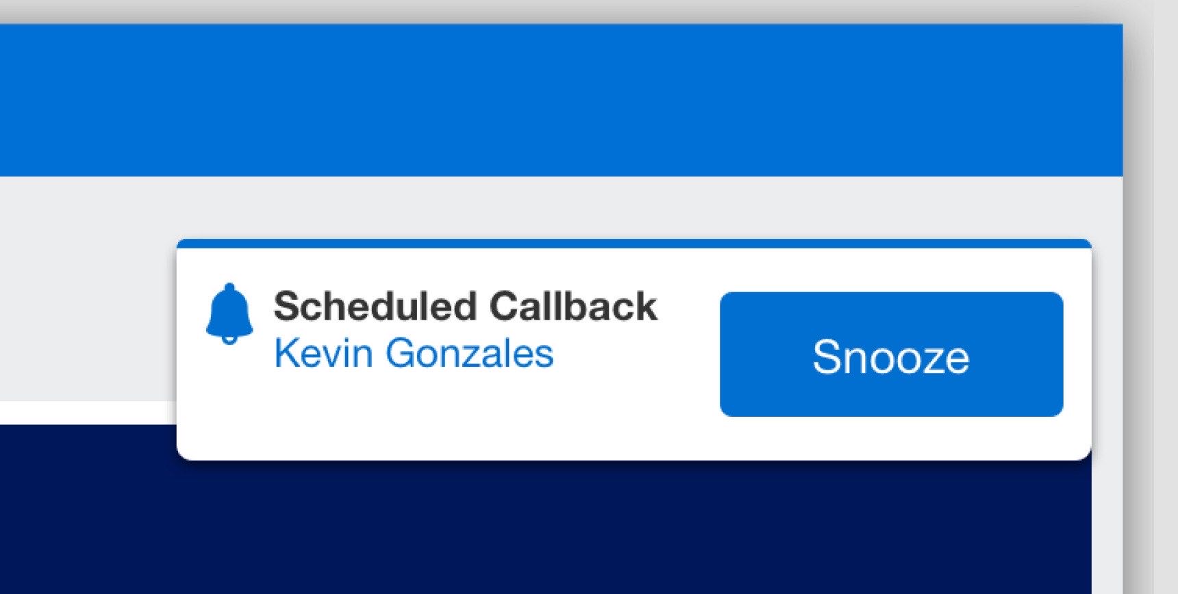
The feature let a Specialist select a peer and define a timeframe for shared visibility. The case remained tied to the original owner, while the recipient received scoped access for the agreed period. When the timeframe ended, the shared access expired and the case returned to the owner’s normal inventory flow. The companion enhancement, Callback Reminder, addressed a related coordination problem: Specialists could schedule a reminder for a customer callback and receive a toast notification when it was time to act.
Outcome
The IPM dashboard shipped, replacing an Excel-and-email workflow that cost each Specialist more than an hour per day. The Send to Peer and Callback Reminder enhancements shipped after launch.
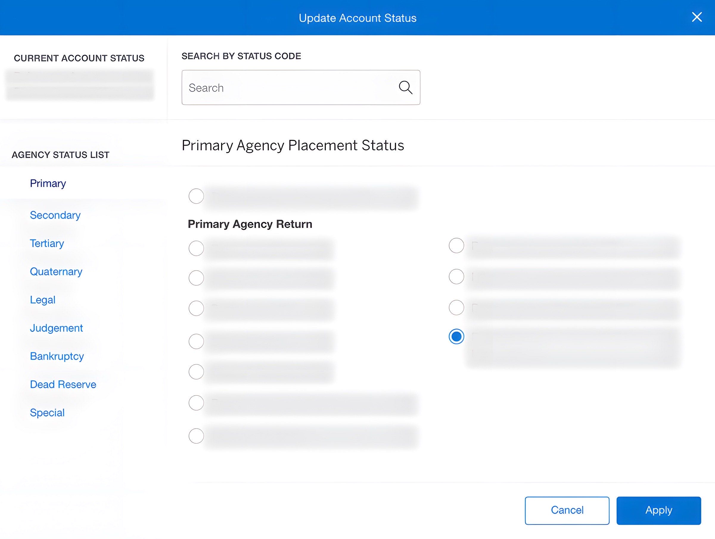
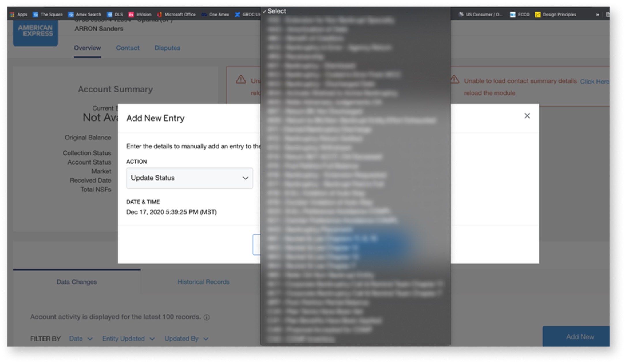
ACP: redesigning account status selection before scale broke it
Advanced Collections Platform · funded and handed off. A flat dropdown causing selection errors and about to break past 200 statuses, rebuilt on the placement-level logic it was hiding.
The Advanced Collections Platform routes past-due accounts to third-party collection agencies. Specialists assign an account status, and that status determines where the account goes next. The legacy interface used a flat dropdown that was already causing selection errors, and the status list was expected to grow past 200 options. A dropdown that was merely inconvenient at smaller scale was about to become structurally unsafe.
Discovery
Stakeholder interviews revealed the structure the dropdown was hiding: statuses were determined by placement level, which reflected how many times an account had been sent to another agency and what kind of account it was, such as high-balance, legal action, bankruptcy, or dispute. That became the core design opportunity. Instead of treating statuses as a long flat list, the interface could expose the placement-level logic Specialists already needed to make the right decision.
Decision · Let testing kill the cheap fix
Development time was scarce, so the first iteration preserved the existing dropdown and added a placement-level filter. That was the cheapest fix. Testing showed it was not good enough: the popup covered the current status, advanced users wanted to type status codes directly, and filtered lists could still run longer than 20 items.
The final design combined the behaviors that survived testing: the current status visible by default, placement-level filtering visible as the organizing structure, and type-ahead search by status code or description for advanced users. It addressed the original selection-error risk and gave the team a scalable pattern for 200+ statuses. It required more development than the patched dropdown, but the testing evidence made the resource conversation concrete: the cheaper solution had failed against the exact scale and accuracy problems the redesign needed to solve.
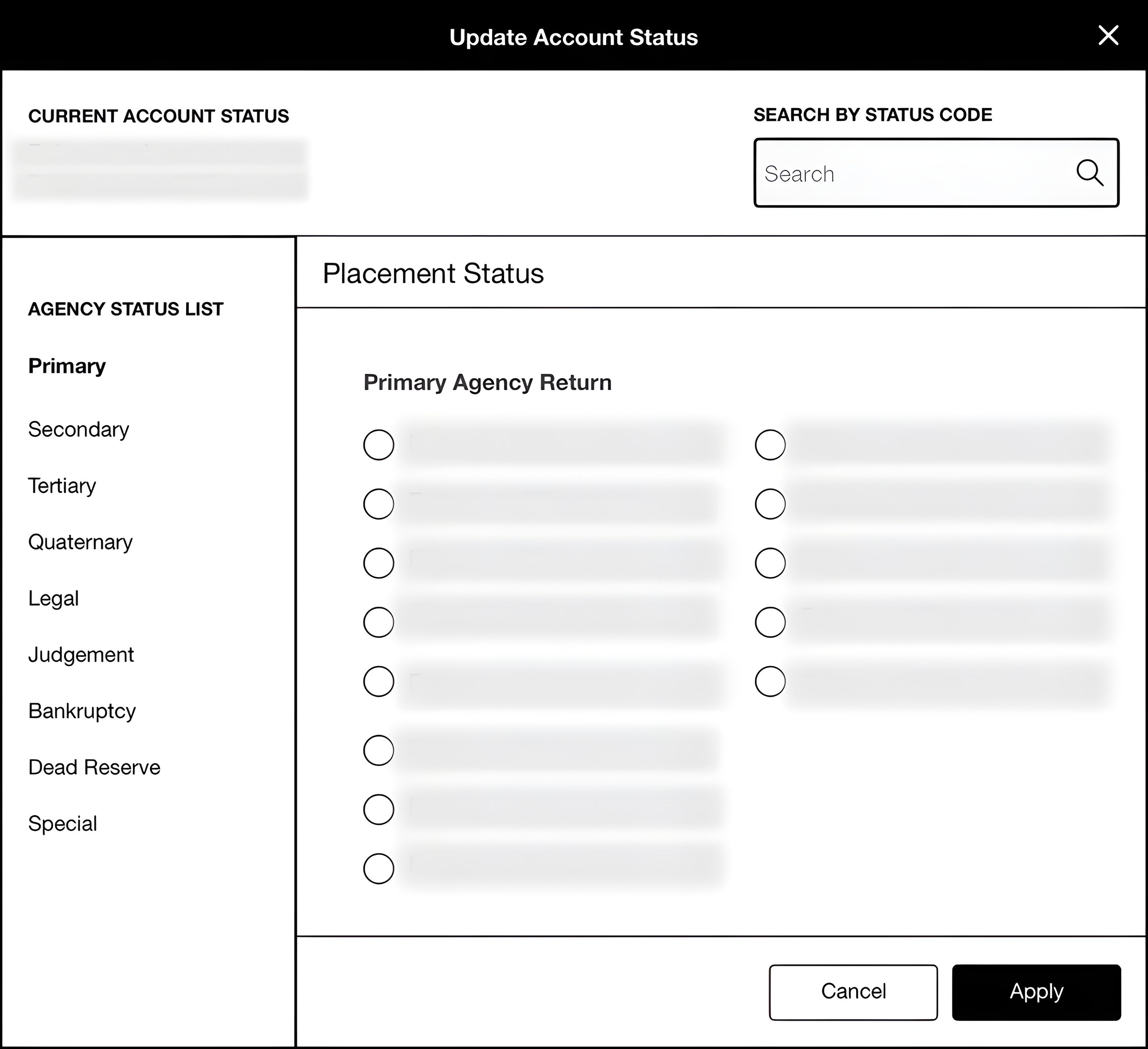
Scroll → The first solution saved development time. Testing showed why it would not survive scale.
Outcome
The final ACP design secured Product Management alignment and development resources. It was funded and handed off; development status after my departure is unconfirmed.
In complex financial systems, the design work is making hidden logic visible enough to trust.
Across three separate product teams, I worked in the same pattern: map the structure, make it visible, and test the decision point with the people responsible for the work. The common thread was operating inside complex financial systems where hidden logic creates risk: a servicing page that hides next steps, a collections workflow managed outside the system, or a status dropdown that can route an account incorrectly.
This work taught me how to design for trust in enterprise financial tools: choose research participants strategically, map before redesigning, make tradeoffs explicit, and let testing invalidate my own ideas before users pay the cost. It also expanded my operating range. Alongside leading UX across three teams, I stepped into Product Owner coverage when the department needed it, translating design decisions into features, user stories, and development priorities. The Billing Reports case study shows that same judgment applied at deeper product-ownership level on a single enterprise reporting platform.
3
Apps to handoff: 2 shipped, 1 funded
1+ hr
Daily Excel entry eliminated per Specialist
200+
Statuses the ACP dropdown was breaking under